


Historians of color-meaning need not only to look at the recent literature affective characteristics of color, but also to embrace that area traditionally called color-symbolism. By far the most useful source for the Middle Ages is still G. Haupt’s dissertation of 1940, Color-symbolism in the Sacred Art of the Western Middle Ages, which surveys and excerpts the medieval literature with admirable toughness. But Haupt, like more recent students of medieval color iconography Peter Dronke, depends very much on texts, and he is naturally somewhat at a loss when color-terms and color-usage do not seem to marry.
In the pre-modern period the study of colored artefacts or material to be a more fruitful line of inquiry than the study of abstract hues, and some excellent work has been done along these lines by Christel Meier, who is preparing a comprehensive dictionary of medieval color-symbolism. In her study of the interpretation of gemstones from Antiquity until the eighteenth century, Meier has shown a subtle understanding of the way in which perceptions of color may be affected by conceptions of what the stone in question means: the same material may be seen at variously colored according to the need for meaning, and this imagined need is primary, rather than flowing from the perception of the color.
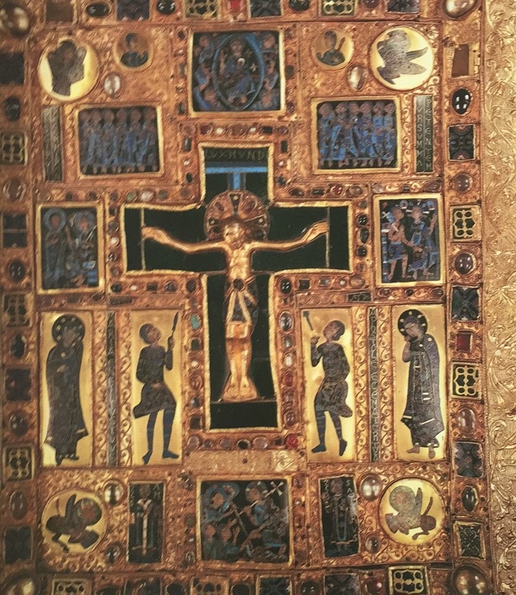
Many observers may share my experience that the identification of a color in a given array is a conscious and verbalized act, and that it is thus dependent upon the available color-language. On the other hand, a good deal of the color terminology in European languages is derived, not from perceptions of hue, but from the materials that characteristically embodied those hues, and from which the hues derived their value and meaning. The most studied example of this is scarlet, but the most striking instances are to be found in the language of heraldry, all of whose specialized color-terms derive front precious materials. In a remarkable series of books and articles, Michel Pastoureau transformed the modern study of heraldry, and brought it out of the almost exclusive province of genealogists and into the history of ideas. He started from the brilliant perception that imaginary coats of arms might be more revealing of attitudes to symbolism than historical ones; and he has gone on from there to survey the vast field of medieval secular and ecclesiastical symbolism. Heraldry offers a particularly fruitful area for the study of color-language because of the abundance of more or less datable armorials, from the early thirteenth to the seventeenth century, many of which are illuminated. The detailed analysis of this language remains to be done, but it is likely to reveal a gradual shift from object-based terms to more abstract ones, a shift in line with the greater capacity for conceptualization perceptible in other areas of color-experience in the later Middle Ages. Closely allied to heraldic attitudes to color-meaning are those of liturgical usage in the Christian Church; and the study of liturgical color, both Catholic and Protestant, has now received an incomparable boost from the exhaustively documented articles in the Reallexikon zur deutschen Kunstgeschichte, which, as usual in this encyclopaedia, are far from confined to German examples.
In the post-medieval period, the color-content of paintings has sometimes been extended far beyond symbolism and into the often highly complex iconography of color. Painters began, from around 1600, to refer in some works directly to the color-theories of their day, for example to the new doctrine of primary colors, in Rubens’s Juno and Argos (1611) or Poussin’s Christ Healing the Blind (1650). Even more explicitly, Turner took up a contemporary debate about the relationship of the hues to light and dark in a pair of paintings of 1843: Shade and Darkness, and Light and Color (Goethe’s Theory) A conspicuous modern instance, characteristically more self-referential than these, is Joseph Albers’s long series Homage to the Square, beginning in 1950 and continuing until the year of the artist’s death, 1976, which relates very closely to his experimental work published in 1963 as Interaction of Color.
Reception and response
A good deal of recent art-historical writing has been concerned with the reception of art effects, and it would be surprising if color did not find an appropriate place in these discussions. Museology has certainly given an impetus to the study of the visual context, in particular to the history of frames and hanging, and to the lighting of the gallery environment. Framing is perhaps closest to the interests of the originating artist, who at least from the mid-nineteenth century often designed his frames himself; but, like the conservationist, the modern framer is often at a loss to know what the original character of the artefact was. 159 Lighting has naturally been far more the preserve of curatorial specialists, but even here the experience of conservators and other optical scientists is emerging from the technical literature and appearing in more general art-historical publications. Framers and lighting technologists are usually, I suppose, animated by the same urge to recreate an original state of affairs that stimulates conservationists and even art historians: Wolfgang Schöne once proposed — seemingly without irony — that historians of art should equip themselves with sets of dark glasses that approximated as closely as possible the original lighting-levels of the artefacts under examination. But the technician, like the conservationist, has to come to terms with the fact that history of the object in question may include the history of its presentation in inappropriate frame or environment; and that the response of the public to work in these unoriginal circumstances must be seen as no less valid than that originator and his or her circle.
Perhaps the least developed area in the history of color is indeed the area of spectator-response, and this is probably because the very impressive advances in the modern understanding of color-vision have not been matched by advances in the theory of color-perception. It may well turn out to be in this area that the historian of art has most to offer the sciences at large. The distinction is, of course, that vision is a matter largely of bio-physical mechanism whereas perception depends upon the psychological controls to which this vision is subjected. The one is relatively easy to examine and test by laboratory methods; the other is not. This distinction is very graphically illustrated by the fact that the number of color-sensations that can be discriminated by the human visual system is numbered in millions, while the number of ‘basic’ terms used to classify these sensations in most languages is believed to be around a dozen. The number of these ‘basic’ terms can be further reduced to three or four ‘primary’ colors, relating to the mechanisms of the eye which translate incident light into sensations of color; and the idea of primariness itself has had a particular resonance in modernist art.
Several researchers into color-defective vision have turned their attention to artists: Patrick Trevor-Roper’s major study The World Through Blunted Sight has now appeared in a revised edition. The effects of congenital or temporary abnormalities, of ageing, and even of drugs might have been expected to be very marked on the color-practice of artists; yet the very tentative results these studies have pro duced must remind us that, in its broadest sense, psychology is more important than physiology for color-usage, and psychology depends upon a wide range of often imponderable cultural factors. The study of the effects of colors on the physiological functions, a branch of research that was especially active in Europe in the late nineteenth century (and, in the form of chromotherapy, especially interesting to Kandinsky), has also proved surprisingly inconclusive, although this therapy is a form of alternative medicine still practiced in several countries. A century of research seems to have shown little more than that, as previously mentioned, exposure to red light increases the pulse-rate and blue and violet light retards it.
Also heavily implicated in modern practices is the use of color in psychological tests, notably in the personality-testing developed in the 1940s by the psychologist Max Lüscher . In the Lüscher Test (in which the subject is asked to arrange eight colored cards in descending order of preference of hue), the order which, according to Lüscher, gives the ‘surface indications of complete normality — dark blue, blue-green, green, orange-red, yellow, violet, grey, brown (‘a darkened yellow-red’), black — is close, in the broadest terms, to the results tests with many thousands of subjects. Lüscher’s widely used Test has as we have seen come in for a good deal of criticism for its lack of precision and concreteness. But there has also been some scepticism about the capacity of colors to evoke or expose states of mind at all – a scepticism that has spread to the very notion of color-harmony which was such a sustaining ideal for color-theorists until well into this century.
Theories of harmony
Traditional theories of color-harmony may be grouped roughly into three classes: those regarding the spectrum of white light as in some sense analogous to the musical scale, so that it could be treated in a ‘musical’ way (Newtonian); those requiring the presence of all ‘primary’ colors in any harmonious assortment, often in a ‘complementary’ arrangement (as in Goethe’s theory); and those regarding the value-content of hues as the primary determinant of their harmonious juxtaposition (as expressed in Ostwald’s color-solid). More recently, experimental psychologists have sought to ground theories of color-harmony in the empirical study of responses to single and paired color-samples by a variety of subjects. This empirical work has done little either to substantiate any of the traditional systems, or to replace them; and yet it remains that harmony is still a very prominent concept among students of color, and that behind several of the color systems currently in use among painters and designers as well as art historians, m Europe and the United States, lies the urge to organize color in a harmonious way. Is this another instance of the gap between theory and experience in modern color-practice?
One aspect of the doctrines of harmony that has maintained a certain buoyancy among historians of art is the analogy with musical harmony, whether through that branch of psychology known as synesthesia (not necessarily involving musical, i.e., pitched sounds), or through looser associations. The high period of synesthetic research was from about 890 to about 1930, and it made a notable impact on attitudes toward color among painters during this period, especially in Germany and Russia In recent years there has been something of a revival of Interest among psychologists in cases of synaethesia but it no longer seems to play a role in visual aesthetics, as it did at its beginnings in the nineteenth century. The looser affinities between color and music, on the other hand, continue to fascinate painters and other students of the harmony of colors. The links between color-interests and musical skills in Matisse, Kandinsky and Klee, for example, have always impressed critics; and in the case of Kandinsky we can now be more certain that his friendship with Arnold Schoenberg helped him to move away from a traditional striving after color-harmony. It was, as he wrote in On the Spiritual in Art (191 1-12), no longer in tune with the age: From what has… been said about the effects of color, and from the fact that we have in a tune full of questions and premonitions and omens hence full of contradictions… we can easily conclude that harmonization on the basis of simple colors is precisely the least suitable for our own time… Clashing cords, loss of equilibrium, ‘principles’ overthrown, unexpected drumbeats great questionings, apparently purposeless strivings, stress and longing (apparently torn apart), chains and fetters broken (which had united many), sites and contradictions this is our harmony.
Representing color
In sharp contrast to the fitful light thrown by experimental psychologists on the effects of color is the illumination offered by philologists and theorists of language over the past two decades. The puzzle of color-terminology — why such a rich human experience of color has issued in such a universally impoverished vocabulary is one that has taxed students of classical philology for well over a century; but it has also attracted the attention of art historians anxious to bring greater subtlety and precision to their own subject. The mapping of color-space through language can of course suggest far-reaching consequences for our understanding of mental structures, and the extensive discussions that have been generated by Berlin and Kay’s synthesis Basic Color Terms of 1969 have extended into many areas of psychology, ethnology and psycho-biology. Much of the raw material has been taken from) non-European cultures, but it is clear that very similar structural Patterns apply in Europe, especially in early periods, and that the use of linguistic material must be drawn into the assessment of color-meaning in a far more systematic way than has been done so far.
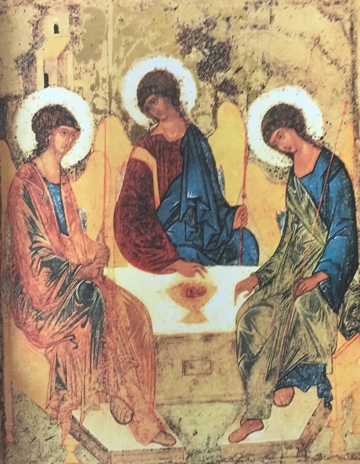
But of course, language is also the tool of the art historian, who can learn much from masters of color-description such as (to name only those writing in English) Robert Byron, Adrian Stokes, Lawrence Gowing,Joh11 Shearman and Paul Hills -writers who have sought to extend the range of hue-description, and to introduce important considerations of surface texture as well as of synesthetic effects into the taxonomy of pictorial color. Here is Byron on one of the versions of Andrej 19 Rublev’s Trinity in the Tretyakov Gallery in Moscow:
The central angel and that on the beholder’s right wear full-sleeved robes, round which cloaks are draped to cover one arm and shoulder. On the central angel these garments are respectively of rich flat chocolate, tinged with red, and of a brilliant lapidary blue, a color so emphatic, yet so reserved, that in all nature I can think of no analogy for it. The angel on the right wears a robe whose tint is of this same blue, but whose intensity is less. Across this is draped a cloak of dry sapless green, color of leaves at the end of summer, whose high-lights are rendered in light grey-green shading off into pure white… All the faces and hands are nut-brown, modelled only by variations in the tone Of the same color, and outlined in black. The outspread wings, whose feathers are denoted by thin gold lines, are a flatter and paler brown, something between tea and toffee, which strikes a mean plane between the figures and the tree.
Confronting color
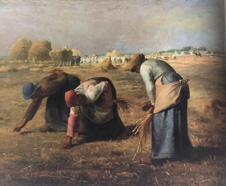
Millet’s highly nuanced handling of color in the monumental composition The Gleaners, 1857, gave rise to one of the great set-pieces of German formalist criticism. Lorenz Dittmann observed in 1987 how: ‘The unusually restrained color (which seem to contradict the monumental forms) follow a closely stepped sequence: reddish tones in the central figure, based round copper-reddish, brownish and bright carmine; delicate nuances of colorful greys in the standing figure to the right; silvery bright blue-grey, dove-grey, blue and turquoise greys. The color-thresholds are kept so low that induction effects are made much easier, which allows the indefinite color-tones to appear as ‘resonances’ . . . ‘
The rich, close-toned palette of Andrej Rublev, the greatest master of Russian Renaissance painting, has inspired a vivid modern ekphrasis by the traveler and art historian Robert Byron. Of the hues of the robes and cloaks in The Trinity he writes: ‘On the central angel these garments are respectively of rich flat chocolate, tinged with red, and of a brilliant lapidary blue The angel on the right wears a robe whose tint is of this same blue, but whose intensity is less. Across is draped a cloak of dry sapless green, color of leaves at the end of summer, whose highlights are rendered in light gr green shading off into pure white… The reddish mauve and the pale slate, the leaf-green lit by grey-green and white, a seen to compose, on examination of the miracle, all the colors of the pearl spectrum.
It hardly needs to be emphasized that the capacity to convey visual sensation with this degree of nuance will draw untold benefits from the reading of descriptive fiction.
On the other hand, several historians of art have sought to avoid the of subjective language by recourse to one or other of the color-order available since the early years of this century. Some early German monographs made use of home-made color charts, but soon after Wilhelm Ostwald published his first manuals of color during the First World War, one gallery at least, the Fürstlich Fürstenbergische Sammlungen at Donaueschingen, attempted to introduce references to his numerical color-solid into its catalogue entries on paintings, if only as a supplement to lengthy verbal analyses. In recent times the American Munsell system has found some favor among art historians in the United States. But it is clear that glossy or matt color-chips can only approximate the nuances encountered in artefacts themselves, and that these nuances are equally subject to the reservations about condition, setting and lighting that I have outlined in my discussion of visual analysis above.
The color-reproduction, whose history is only just beginning to be written, is another tool with which some art historians have hoped to outflank language. The development of a theory of three ‘primary’ colors in the seventeenth century provided the basis for mass-produced color-reproduction that could imitate paintings, and the first technician to exploit this possibility was the German J. C. Le Blon. Although the rarity of Le Blon’s prints today may suggest that they were mistaken for paintings, the technical difficulties of his, and his successors’ processes meant that very little could be clone in the way of color-facsimiles until the development of chromolithography in the nineteenth century, and even here, the results were far from impressive until the 1890s. Color photography, announced as early as the 1840s, did not become a viable reproductive technique until the early years of our century;and it took almost as long — until the 1950s for it to be widely accepted as a research tool, although Aby Warburg and, surprisingly enough, Bernard Berenson used it in the form of lecture-slides around the time of the First World War. The English art Magazine Color, which started then, depended upon the extraordinary new developments in mass-produced color reproduction; and in 1920 it carried testimonials to the reproductions’ fidelity from a number of ‘great artists. But for the scholar, acceptance of color either in books or in slides came very much more slowly: in the early the of color-documentation through photography still seemed to be in the future. Twenty years later a conservationist wrote that color-reproduction seemed ‘fast approaching perfection’ as a research tool, but there was, still only a grudging acceptance in other parts of the profession. In the early 1950s, when UNESCO began its catalogues of good color-reproductions, the Skira series Couleur-Histoire, the first series of art books, it seems, to print all the color, appeared to Roberto Longhi to usher in a new era when all art would be stocked with color-photographs.
The case of color-slides is somewhat different, although in the United States they were widely recognized as teaching aids as early as the not long after commercial color film became generally available. This was not the case in Europe Edgar Wind never used them at Oxford in the 1950s, and when I first lectured at Cambridge a decade later they were the exception rather than rule. This is not the place to argue the pros and cons of photographic color-reproduction, whose limitations are as well known to technologists as to their clients;it is only necessary to out that. as Wind recognized, these limitations are themselves the history of color art.
The history of color
It will be clear from my comments, omissions and emphases in this largely bibliographical essay that I think that some lines of inquiry have proved, or are likely prove, move fruitful than others. Like Michel Pastoureau, I believe that the study of color Western art must proceed along broadly anthropological lines. But in many cases raw materials and artefacts and their documentation are more sophisticated and complex than those familiar to anthropologists, so that their methods cannot always be usefully brought to bear. Like Pastoureau, too, I believe that an overview of the history of color is essential if we are to overcome the standard misunderstandings of local and period-specific aspects of color in art (for example the notion of a fixed set of color-values in medieval art, or of the scientific competence of Seurat).
Historians of color must also face the possibility that throughout much of European history their interest has, indeed, been a very marginal one; that, forexample, coats of arms were often presented in a monochromatic form on tiles and seals, and that when they came to be engraved, there was little attempt, until the early seventeenth century, to convey the identity of the colors of blazon by graphic signs. But possibly marginal concern must itself be a fact of the history of color; and even the shifting identity of certain hues (such as yellow/gold, red/purple) must be understood as part of the historical experience of color itself. In this sense disputes about color all periods can be particularly valuable to the historian.
Color seems to me to be of special importance to the art historian precisely because it obliges him or her to engage with so many other areas of human experience. Because it is almost invariably itself, and very rarely a representation of itself and because it is the stuff from which representations are made, color must be experienced concretely in artefacts. Thus it offers a corrective to that lively branch of our subject that, despite the voguish topic of ‘the gaze’, has sought in recent years to exclude visibility from its discourse and to focus on ‘text’. In short, color must redirect the history of art toward the assessment of the visible; and this alone should put it high on any future art-historical agenda.